Voxguru
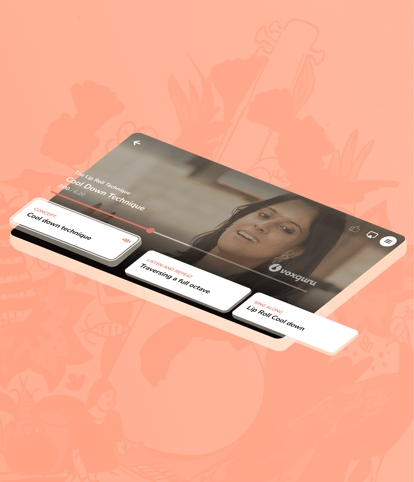
E-learning consumer app, reimagining music student engagement, setting up a new precedent for music learning experiences.
ROLE
To revamp the interface and experience of the MVP by identifying bottlenecks and areas of improvement in order to enhance customer satisfaction and to drive business growth.
CLIENT
Voxguru
PROJECT TIMELINE
4 Months
Project Discovery
A discovery workshop consisting of 3 sessions were conducted with with the stakeholders, product team and dev team. The goal was to:

Qualitative and quantitative research methodologies were undertaken to develop a product acumen.
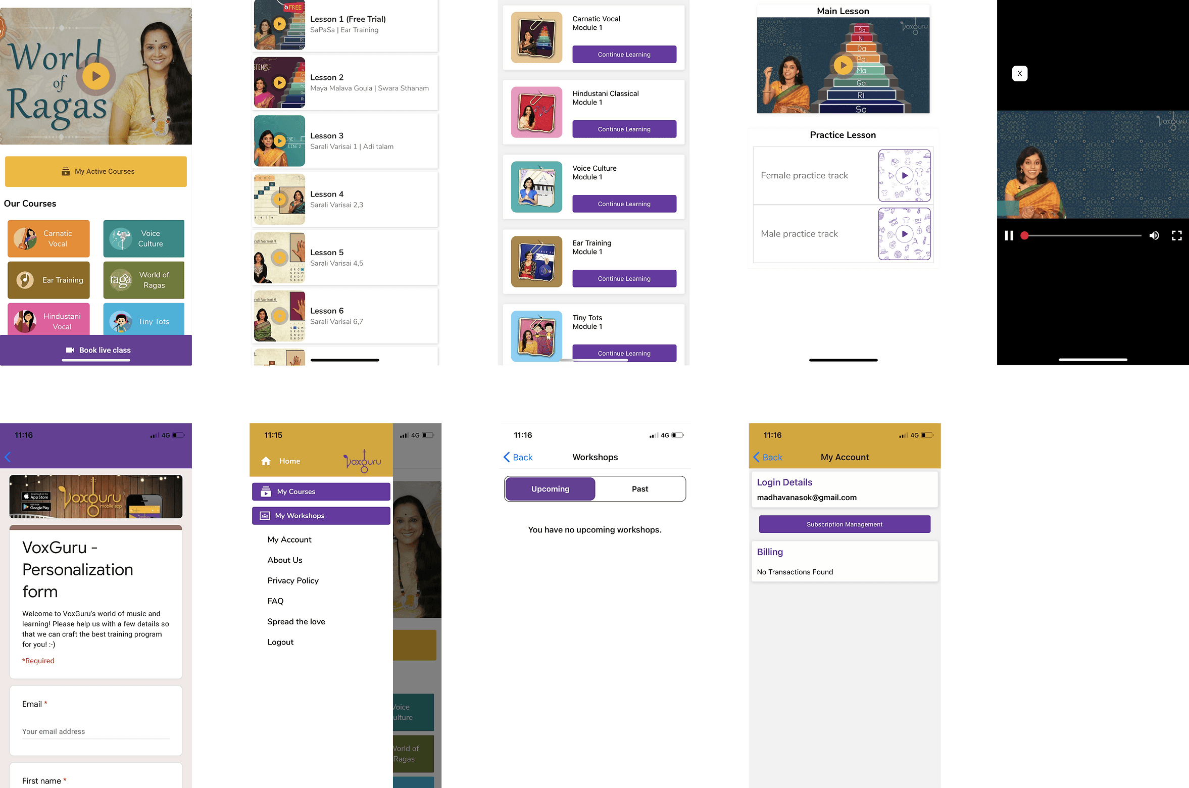
Design Audit and Heuristic Evaluation
Voxguru MVP was assessed using heuristic and design principles to understand bottlenecks and areas of improvement. Furthermore, an IA of the MVP was created to better understand the ecosystem.
User Survey
The survey questioned users about their interests/experience in learning music, their view about a music-learning app, and what they felt about paying for music lessons online.
User interviews and Focus Groups
One-on-ones and group discussions with multiple users were conducted to explore their attitudes, perceptions, and opinions.
I’m not sure if learning music through online lectures, let alone through a mobile phone, would be efficient
when it comes to a new learner.
It’s hard to pursue a hobby such as learning music amidst my busy schedule. I’m pretty sure I might lose interest in between if there isn’t someone to actually push me.
“I have learned little music in my childhood and I installed this app in hope of catching up to my old skills. But I didn’t feel like subscribing to the courses they provided.”
Project Definition
The insights gathered during the discovery phase were analyzed and synthesized to define the core problems and solutions.
Passive learning experience(Causing drop-offs)
A Personalized, handholded course plan with a more linear and active learning experience can offset this issue.
Substandard desirability(Hampering conversions)
Improving content visibility along with introducing consistency and delight can enhance product desirability.
Ideating Voxguru 2.0
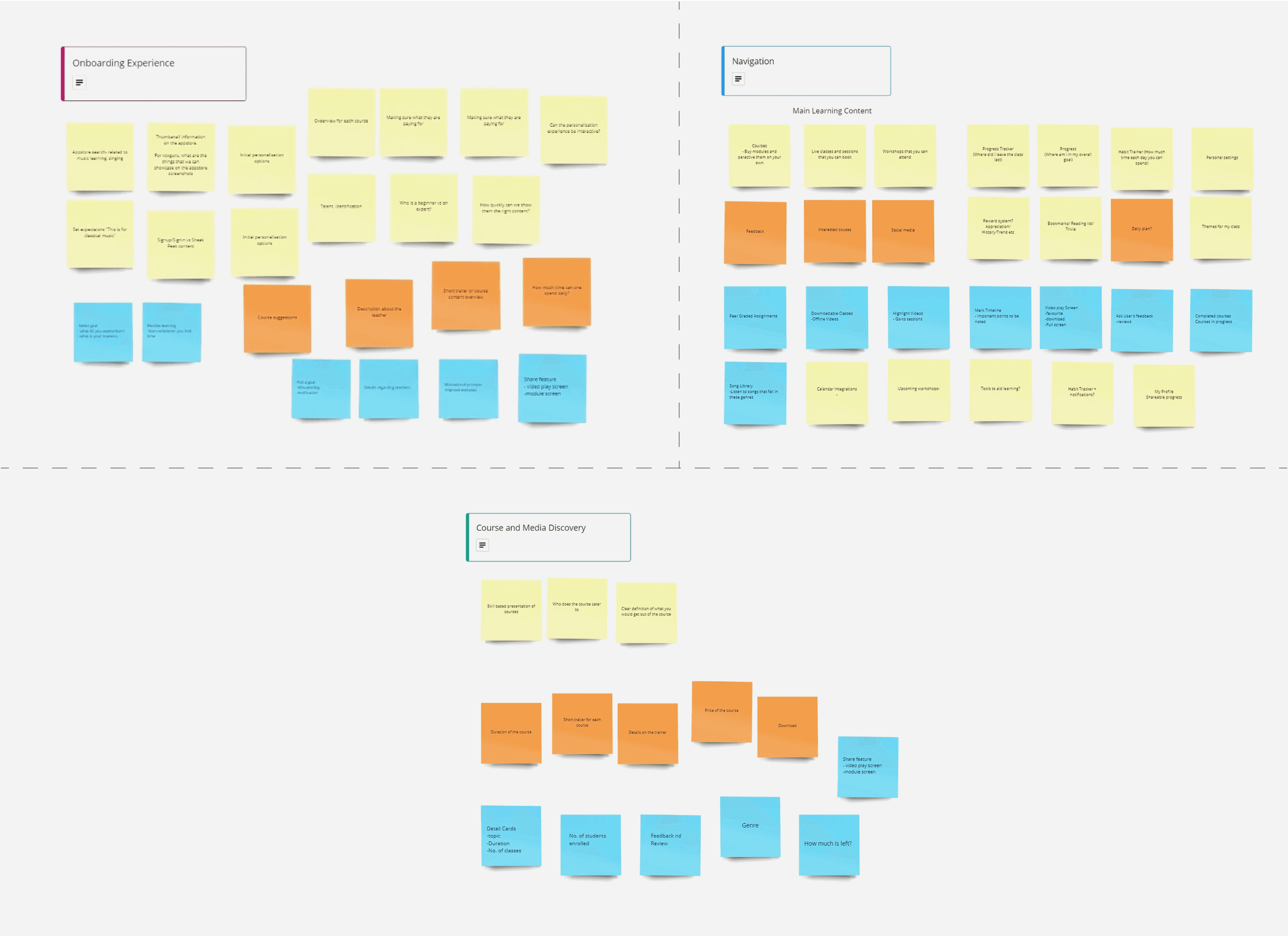
Features were listed, prioritised and mapped to each modules of the new product.
Wireframes
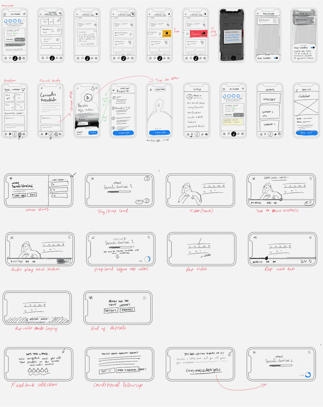
Layout planning, navigation design and content organisation was done using low-fidelity wireframes for obtaining early feedbacks from stakeholders, product team and dev team.
Potential issues were resolved; Alignment on design intent and development feasibility were confirmed.
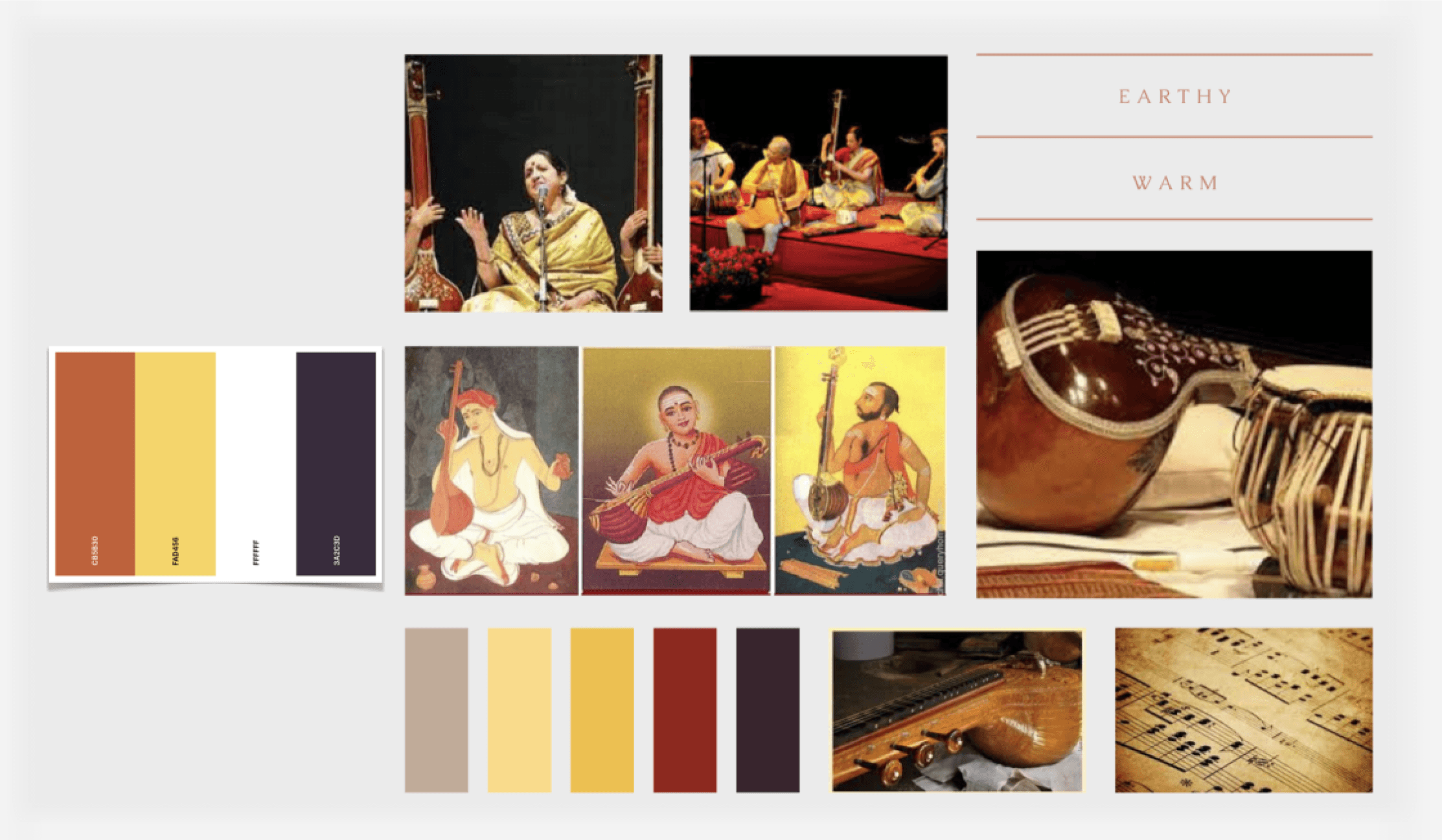
Moodboard
In order to set the mood of the app, product personality was defined:
Voxguru is a motivating teacher who cheers her students to achieve the set goals. She is compassionate, fun and wants to help students stay on track so they can reach their goals.
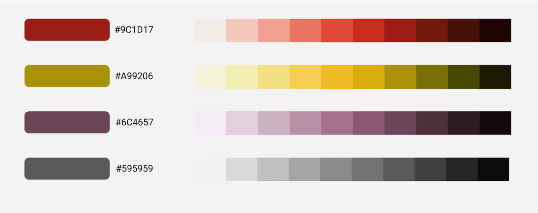
Colour Scheme
It was analysed that the existing colour scheme of the app was quite received by a certain demographic but not by the rest. By considering the former branding, new colours were introduced that were fresh but also evokes a feeling of familiarity thereby catering to all the users.
Typography
A legible font that blends along with the warm, friendly nature of the Voxguru app while rendering consistently across different devices was selected.

UI Design
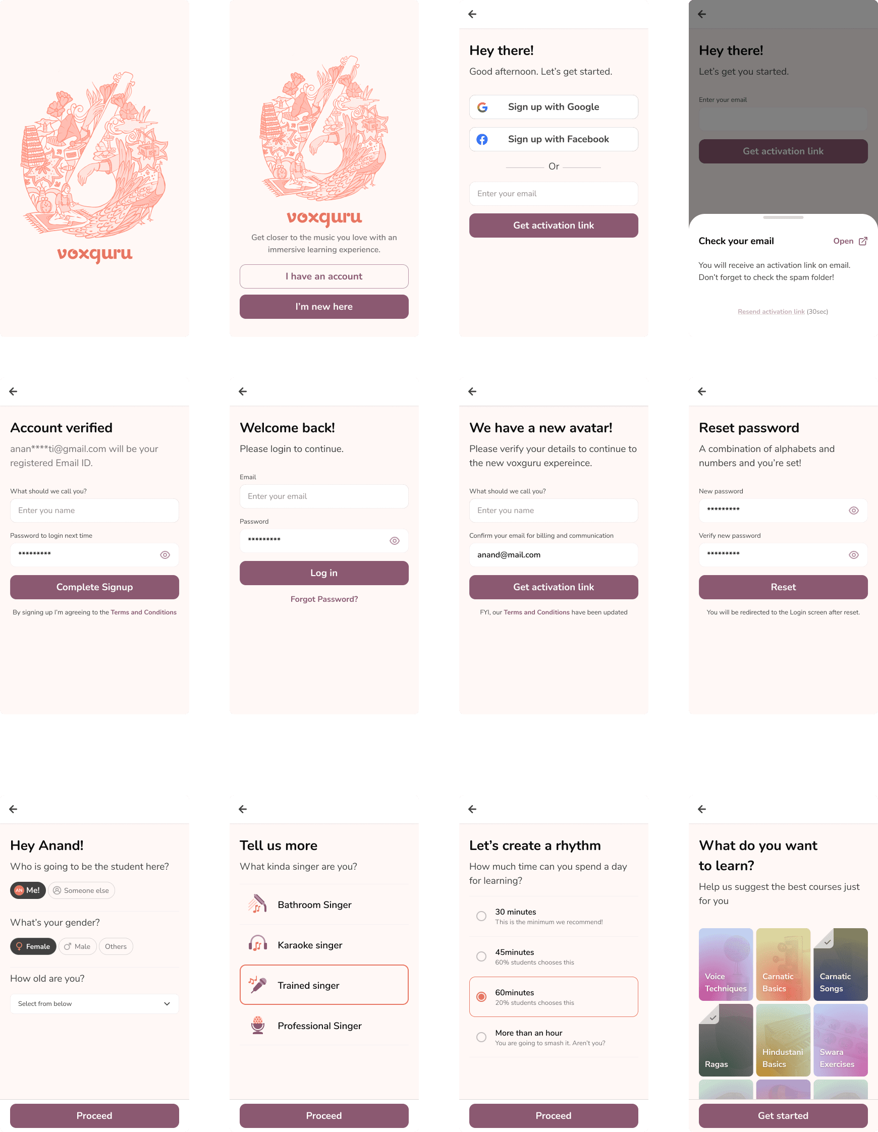
Onboarding
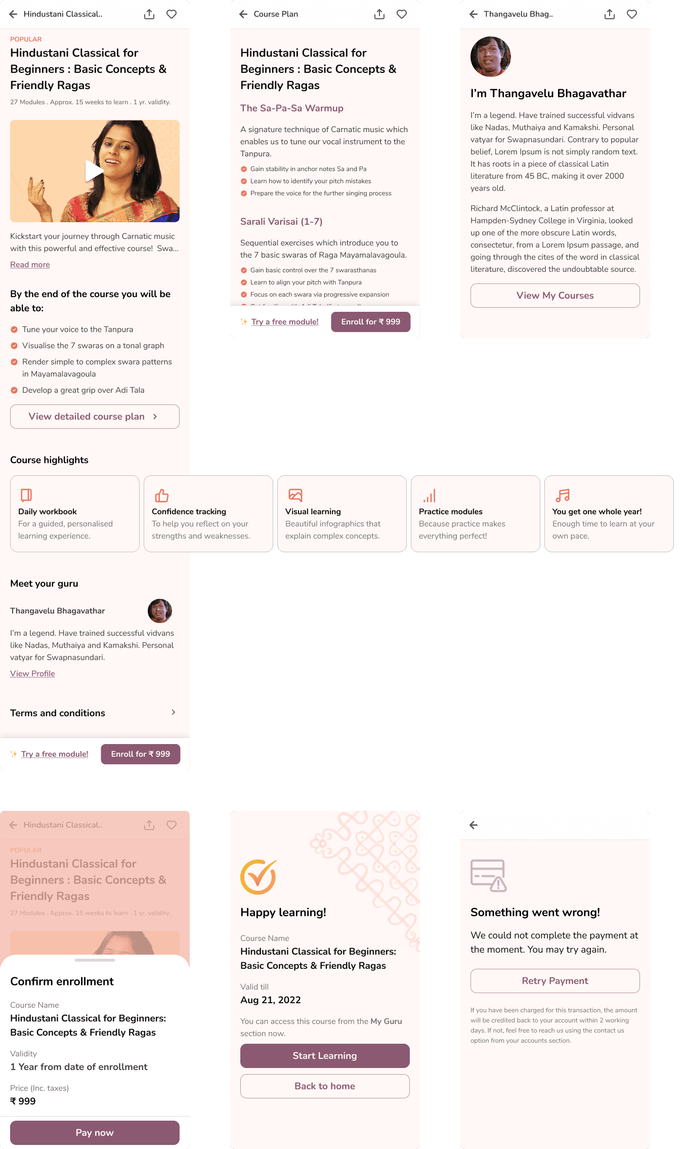
A smooth onboarding experience catering to both first-time and returning users were created which absorbed user data that helped tailor a personalised experience to the users.
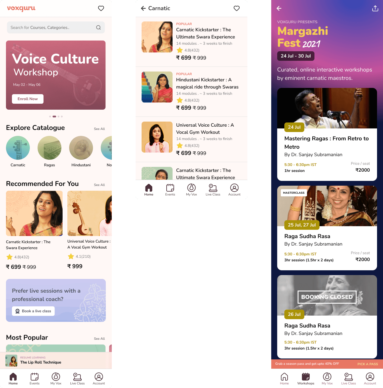
Content Discovery
Improved navigation design and enhanced content visibility paired with consistency and delight was introduced to improve value proposition.
Introducing these greatly enhanced conversion.
Learning Module
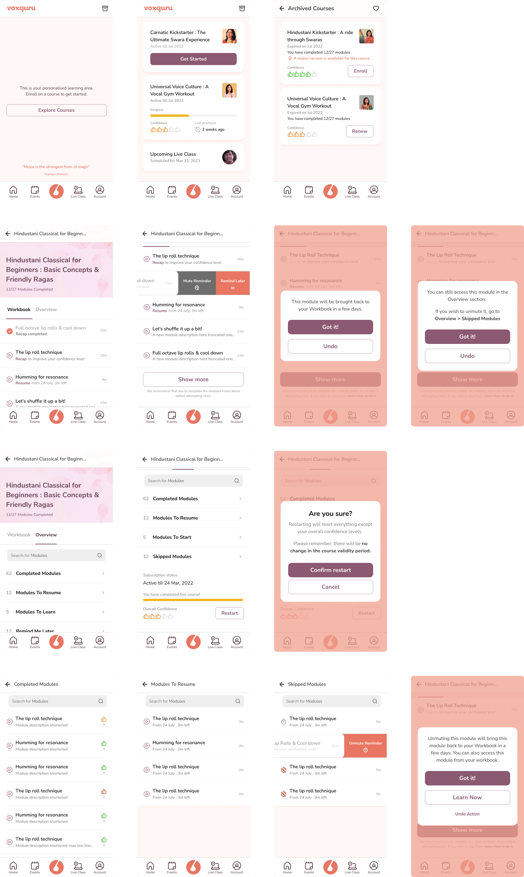
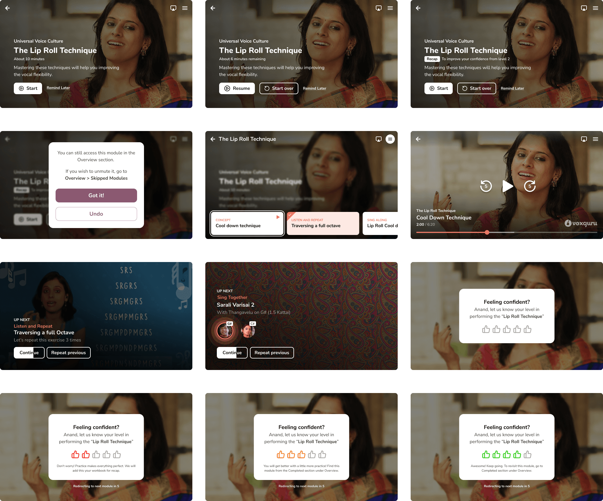
A personalised learning structure was introduced which created a handholded, active learning experience to the users with a more efficient learning curve. Key features include Daily Workbook, Confidence Tracking, Visual Learning, Practice Modules etc.
A drastic decrease in drop-offs and high retention was observed.
Have a good project idea? Let’s make it great!
Feel free to get in touch
madhavanasok@gmail.com
